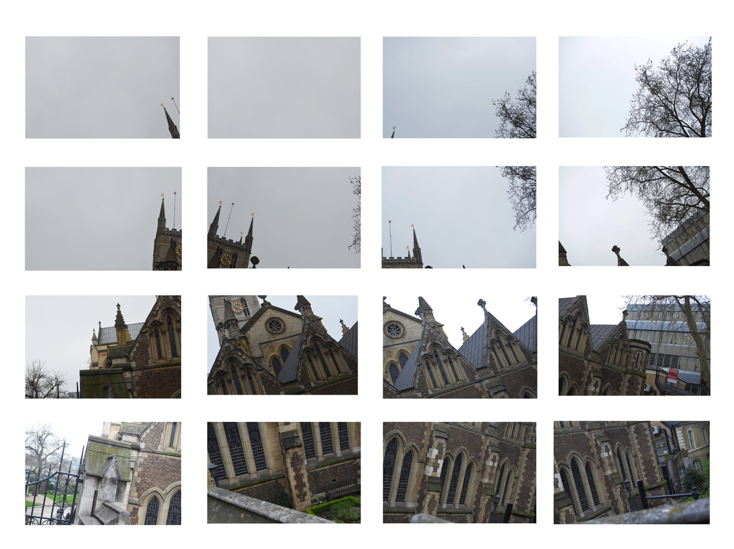
Pintrest
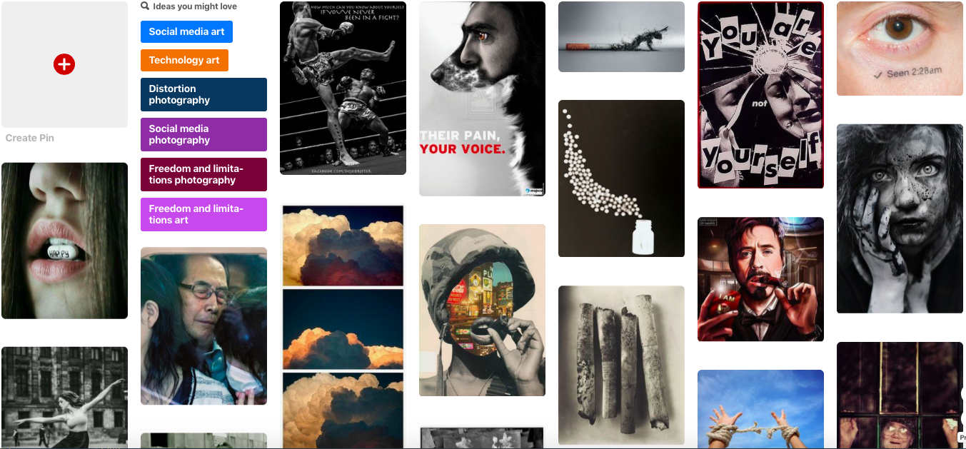
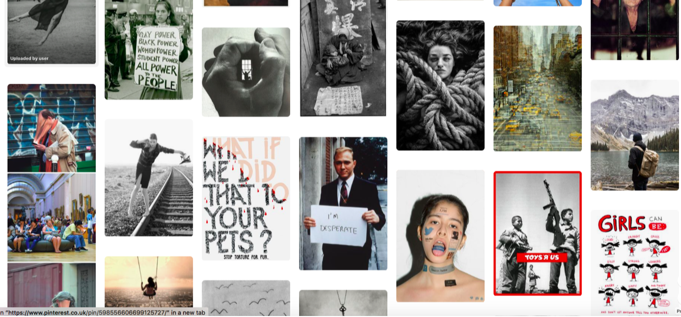
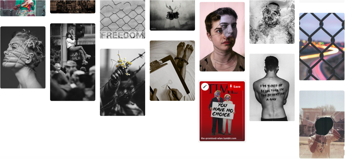
I collected images on Pintrest that fit the theme of freedom and limitations. This was so I can gather some knowledge and insight into the title and start to unpick the meaning. This also was a good source for inspiration for creating my development strands.
Movment
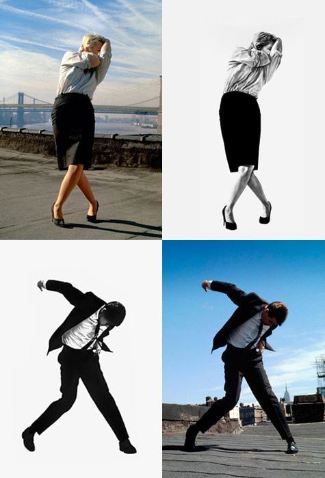
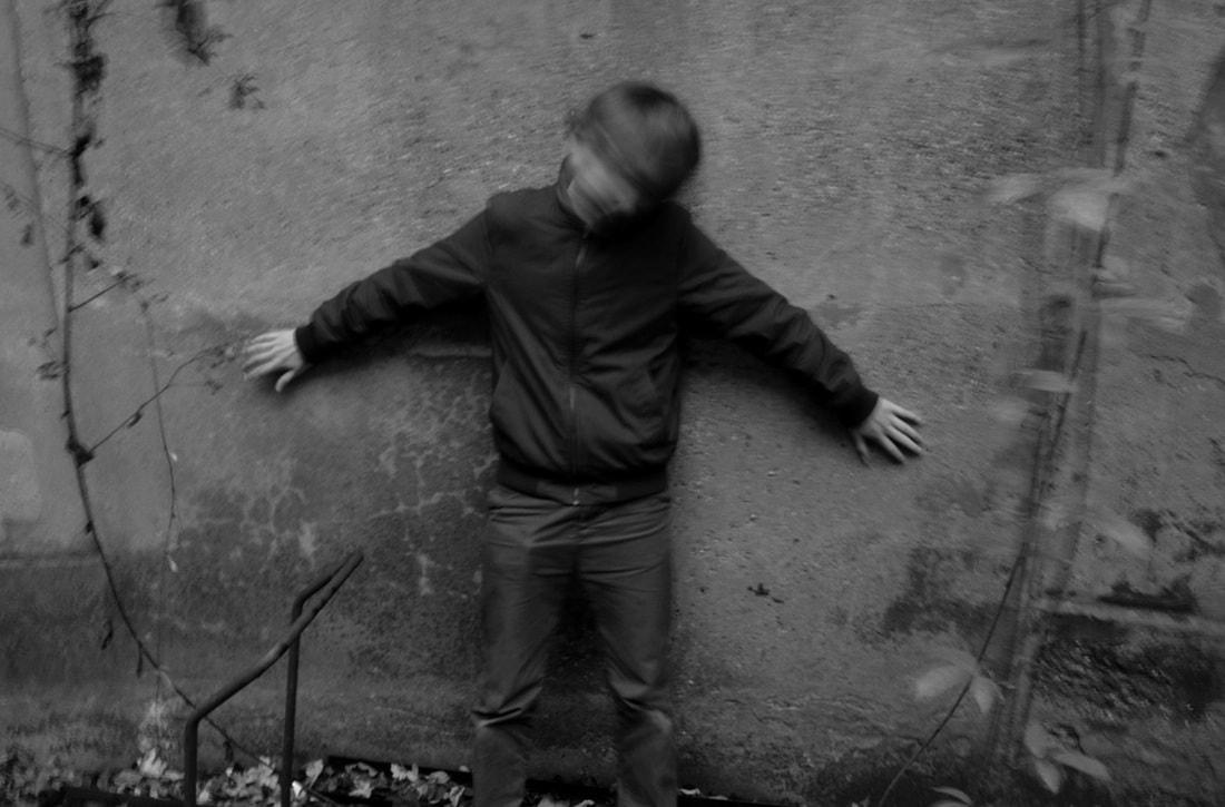
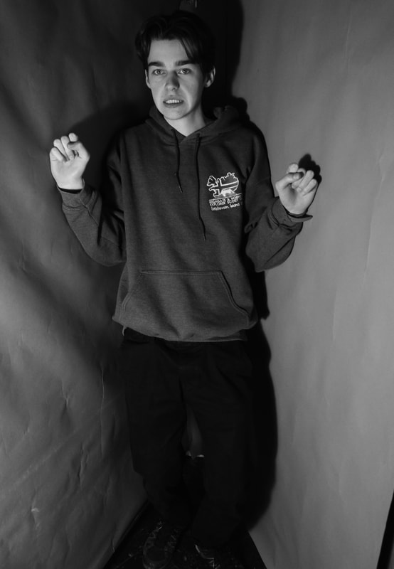
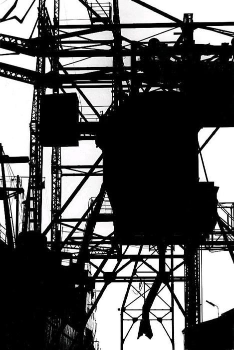
The physical camera has limitations which are controlled by the shutter speed aperture zoom and focus. For this task I will be experimenting with these components to push the limits of my camera. These controls can capture movement in different ways. How you capture movement can give the impression of freedom or freeze a moment, trapping the figure in a still that appears to imprison them. Or with a slower shutter speed capture the subject in a way that you can see the movement of the subject. For the fast shutter speed, I decided to look at two artists: Philippe Halsmann and Robert Longo. Both artists experiment with fast shutter speed priorities, yet their aesthetic results vary, as presented below.
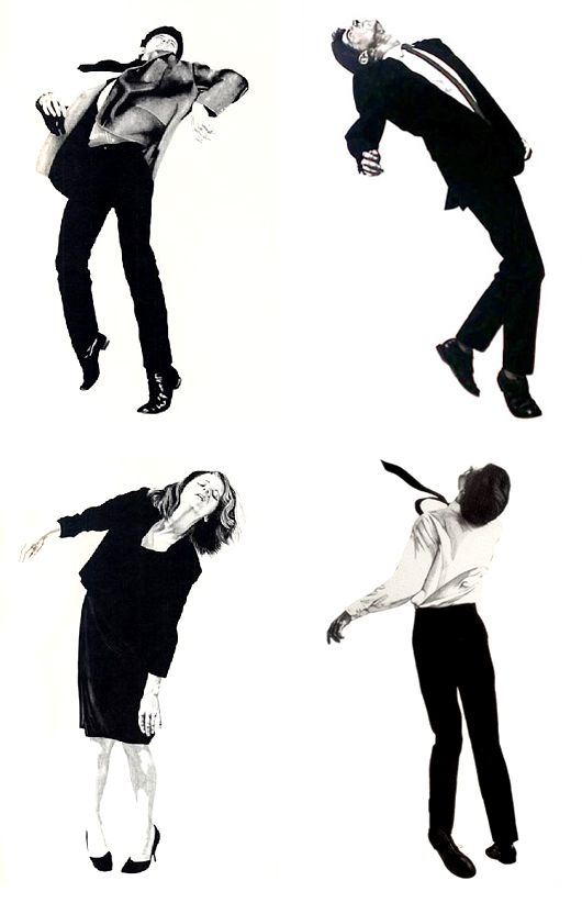
Robert Longo
Created between 1977 and 1983, the figures appeared trapped in a tortuous moment, limited by their daily grind. The lack of background exemplifies this idea. Despite the dynamic movements the figures are sharp with no sign of movement or blur.
|
|
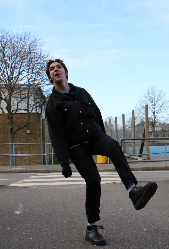
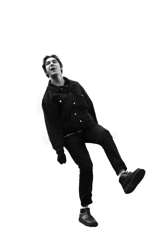
My Response
My response to Robert Longo below didn't really capture the same pain that Robert Longo captured in his images through the facial expressions. In my response the subject is smiling which removes the sense that he is trapped in a torturous hell and he looks happy and free.
|
|
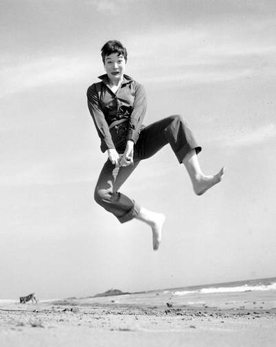
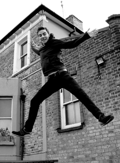
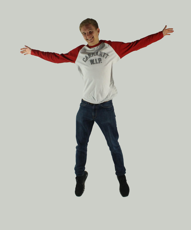
Fast Shutter Speed
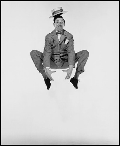
Philippe Halsman
Philippe Halsmann believed that people expressed their true selves when they jumped:
"Starting in the early 1950s I asked every famous or important person I photographed to jump for me. I was motivated by a genuine curiosity. After all, life has taught us to control and disguise our facial expressions, but it has not taught us to control our jumps. I wanted to see famous people reveal in a jump their ambition or their lack of it, their self-importance or their insecurity, and many other traits."
"Starting in the early 1950s I asked every famous or important person I photographed to jump for me. I was motivated by a genuine curiosity. After all, life has taught us to control and disguise our facial expressions, but it has not taught us to control our jumps. I wanted to see famous people reveal in a jump their ambition or their lack of it, their self-importance or their insecurity, and many other traits."
|
|
My response
When trying to replicate Philippe Halsmann's work, I took the actions of the subject and the background into consideration. I used the studio as it had a white background like Halsmann's, and I asked the people to jump up straight, use their arms jump in various positions in order to get different results. After shooting the images, I used photoshop to turn the image black and white, and change the contrast and tones of the images to try and make the black and white look like blocks of colour. In order to improve them I would change the clothes they are wearing to more professional clothes, as well as taking more images.
|
|
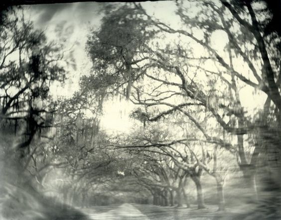
Slow shutter speed
I then looked at slow shutter speed artists. I decided to look at the work of Francesca Woodman who experiments with slower shutter speeds in her own unique way. This is illustrated beneath. Now that we know that Woodman committed suicide at 22 we can project a greater meaning on the images. Some critics have considered the images in the context of her mental health at the time and reached conclusions that she felt trapped and was looking for a way to escape.
Francesca woodman
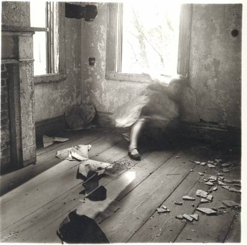
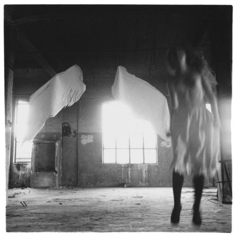
Francesca Stern Woodman (April 3, 1958 – January 19, 1981) was an American photographer best known for her black and white pictures featuring either herself or female models. Many of her photographs show women, naked or clothed, blurred (due to movement and long exposure times), merging with their surroundings, or whose faces are obscured. Her work continues to be the subject of much critical acclaim and attention, years after she died by suicide at the age of 22, in 1981. Her images often have a dark, enigmatic and spectral atmosphere that can be observed to portray a sense imprisonment, which is aided by the derelict surroundings and the inclusion of a black and white effect.
My response
In my response to Francesca Woodman I kept the black and white aesthetic as i feel it sets a darker tone and affects the overall image. I also made sure there was only one subject so the images are more intimate and you can connect with the subject more.
Intervention
People intervene in our lives everyday and the smallest change can have a knock on effect and eventually lead to something big. In these sets of observations I will look at peoples freedom to busk in a variety of ways from drawing to standing still, playing instruments and even asking money for drugs.
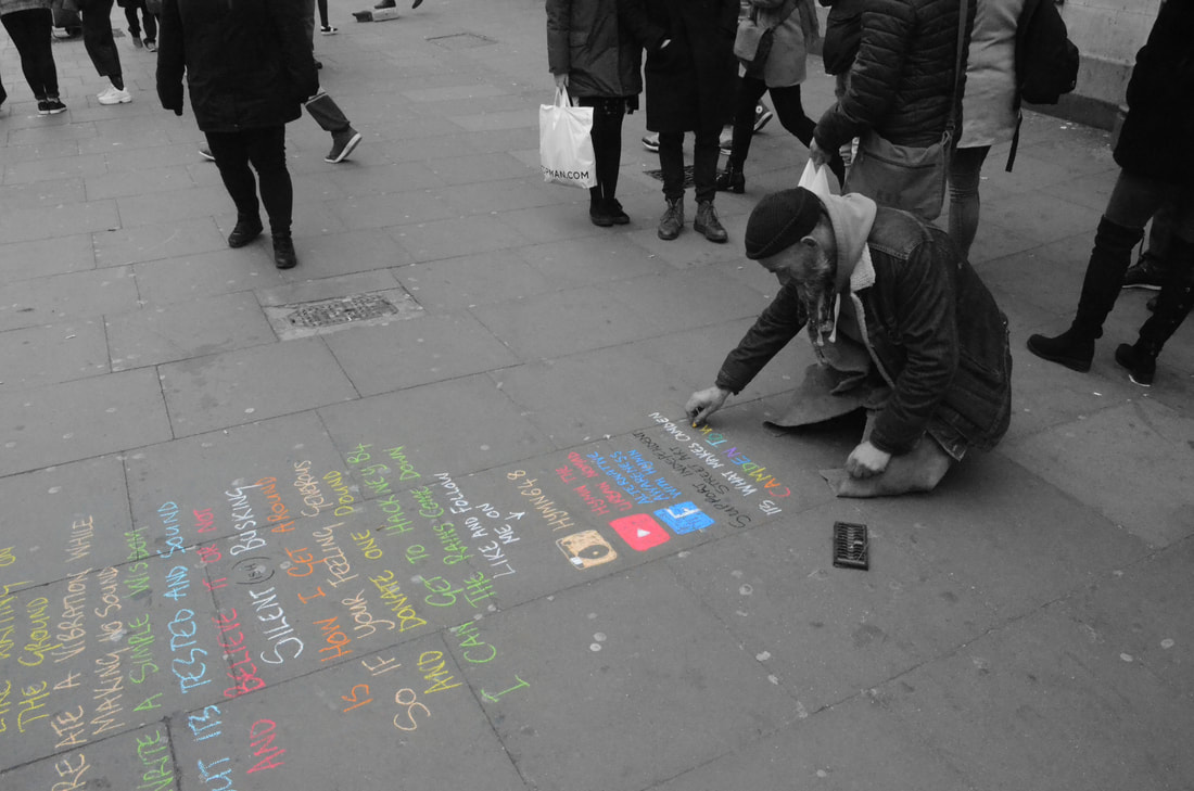
Leaving a mark
My response

In my response I looked at Richard Long's work and changed it and looked at how people alter their surroundings in an urban environment. The image is of a man drawing in the street in Camden. I chose to make everything in the image black and white except for the writing on the ground to emphasise the mark on the ground.
Street performance
Street performers express their freedom and right to speak and perform in public. In these images I captured different types of performers to show the wide range of ways people can express their freedom through performance.
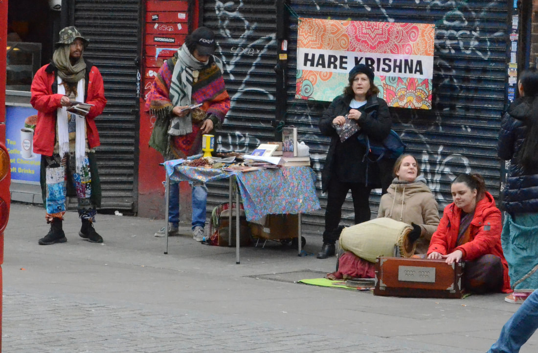
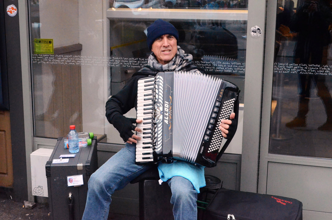
People performing on the street for money has very different views in the eyes of society. some people think that this is a form of begging and that they should get a 'real job' and find them annoying. however some people think that they bring a unique feel to an urban environment and that without them city life wouldn't be the same. But they have the right and freedom to choose to do this which is what links this section to the overarching theme.
Challenging accepted behaviour
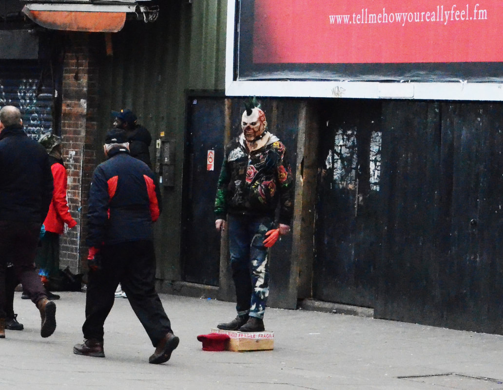
In this image the person on the right is humorously asking for money for drugs. This could attract people to give money as they may find the humour funny.
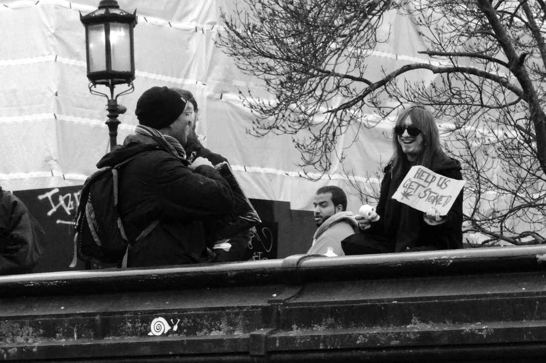
This section was interesting to look at the way people express their freedom in the streets in Camden. If I had more time to do more work on this section I would go to different areas in London and see how peoples attitudes differ from place to place.
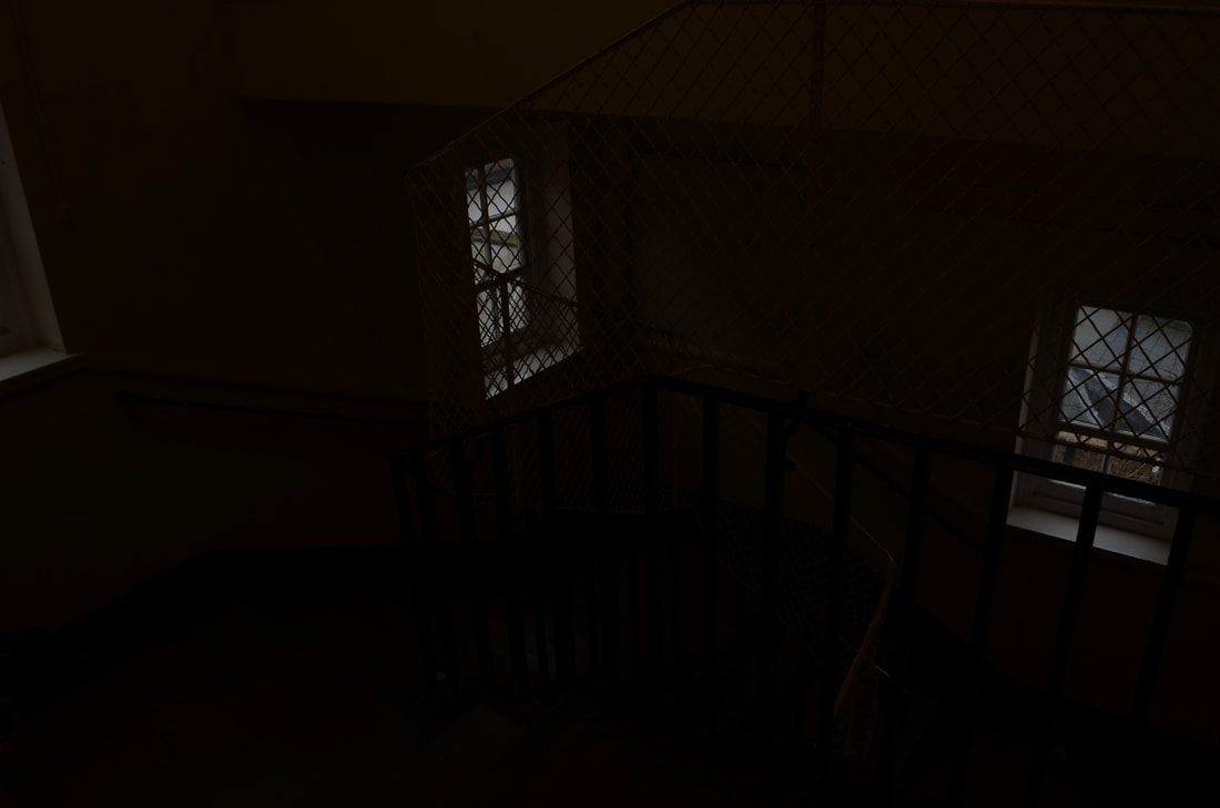
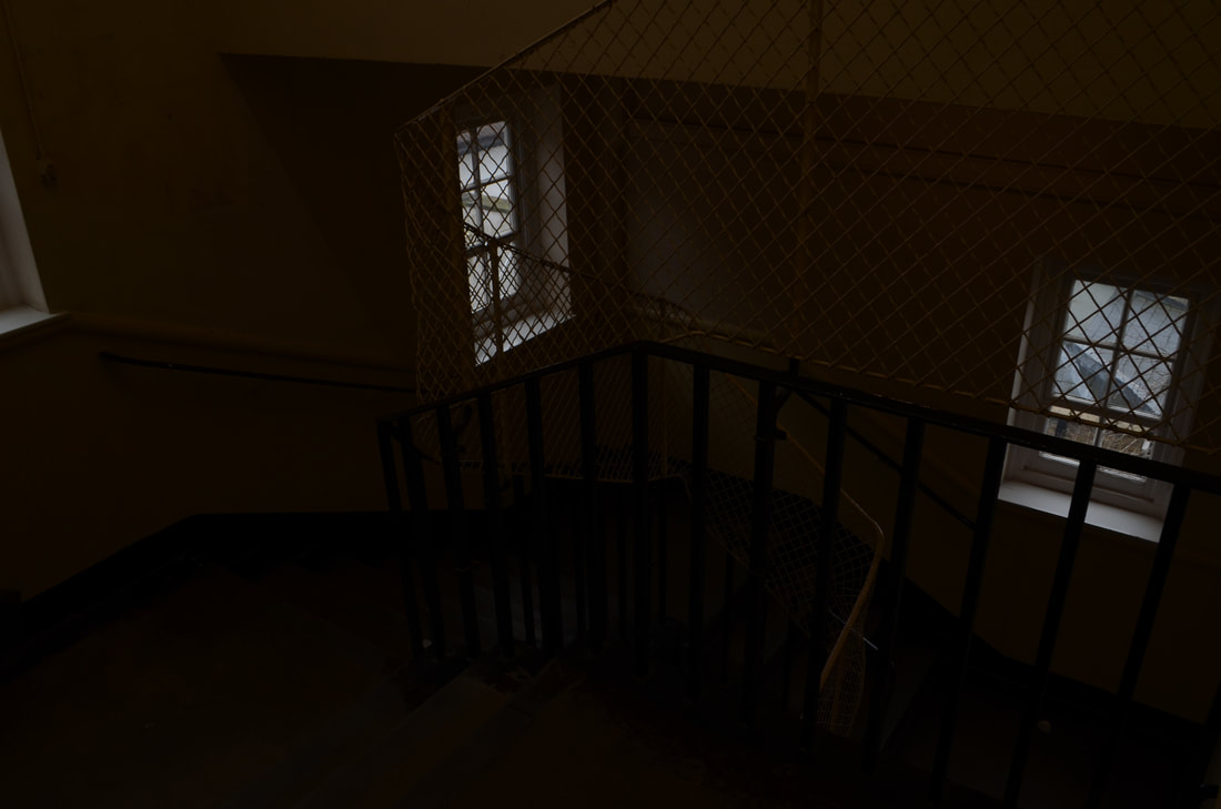
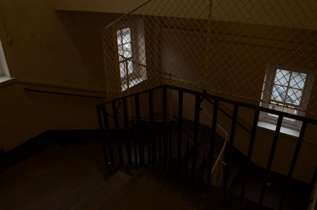
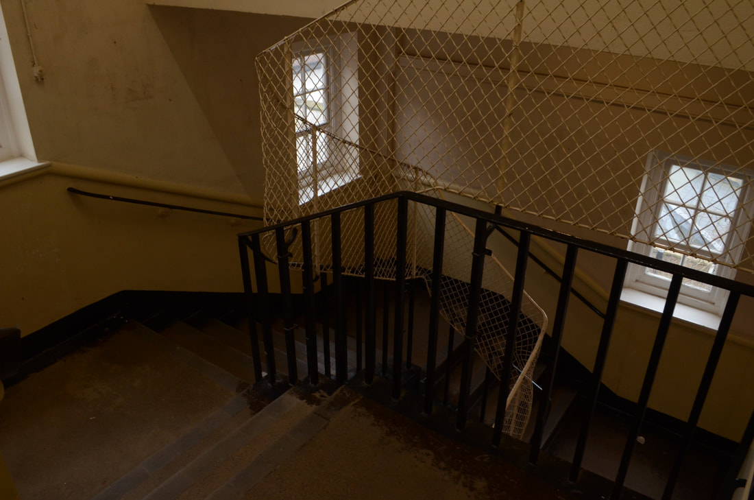
Breaking the structure
What do we expect from a photograph? Focus, strong composition, good exposure? Do we value an image less if it lacks any of these elements? Create images that challenge these preconceptions.
Challenge each of the following expectations.
Challenge each of the following expectations.
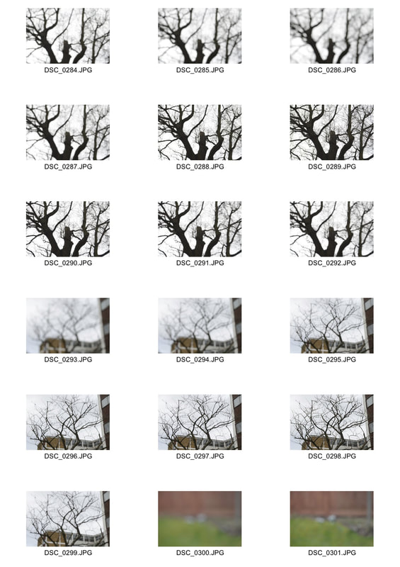
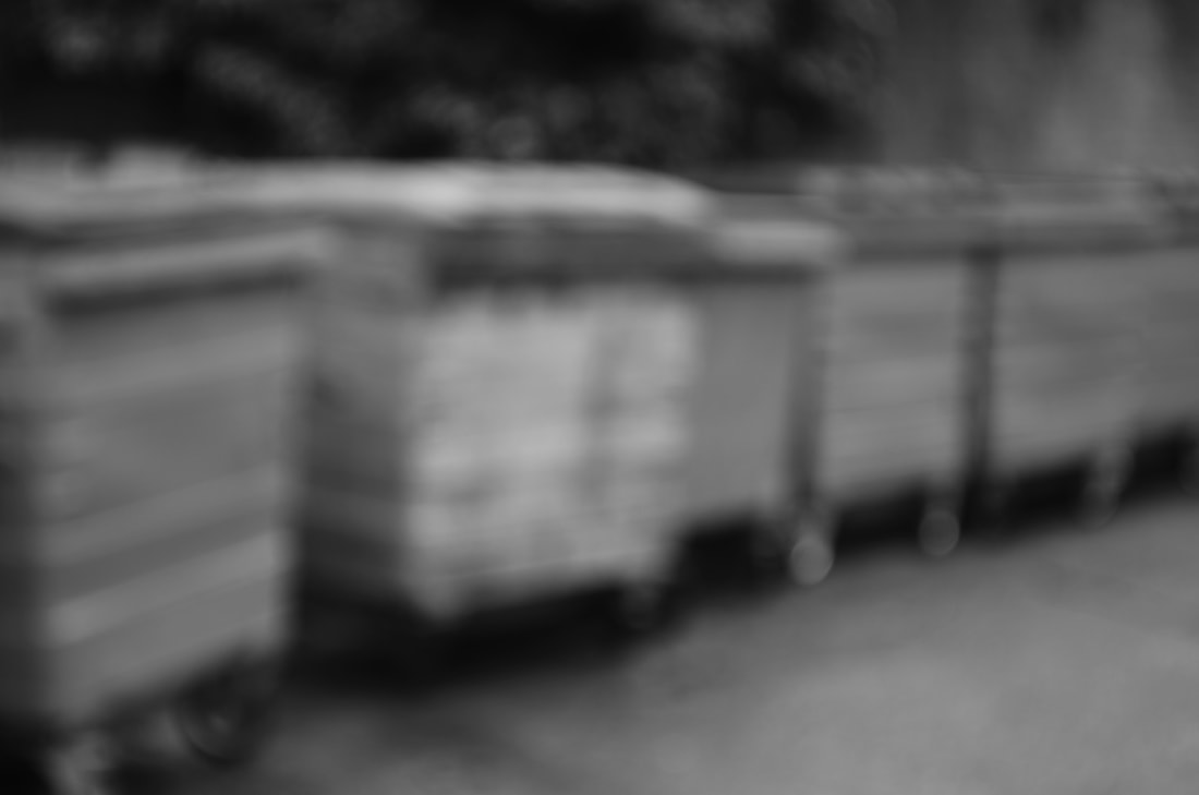
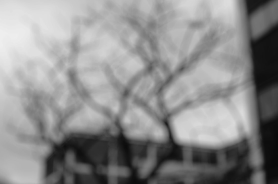
Focus
|
|
|
|
I like images that are intentionally out of focus as I like the fact you can see the outline and big details of the subject but the small details are too out of focus to be identified.
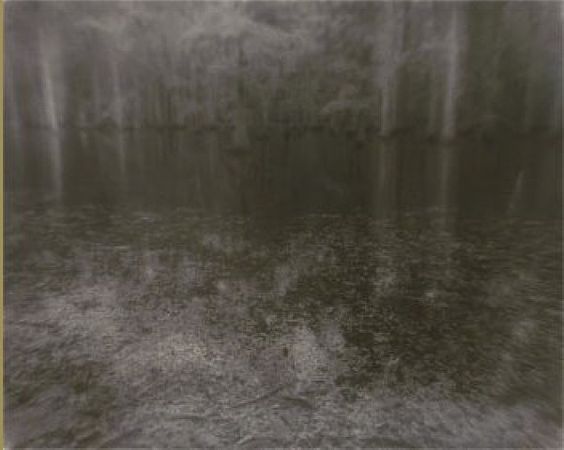
Exposure
Sally Mann
Sally Mann manipulates exposure in film and digital photography in order to alter the atmosphere and mood of the images she shoots, often resulting in ambiguous photographs that are difficult to interpret. The lack of contrast in many of her darker photos adds to this effect, flattening the image as opposed to increasing its vibrancy and resulting in a opening to a freedom to different interpretation and representation.
Response
In this task I was limited to using a DSLR so I couldn't experiment with exposure i the dark room and play with the lighting to see the change with more or less exposure. However I still did this manually on the DSLR by changing the aperture on the camera and the ISO.
ISO Settings
100 200 400 800 1600 3200 6400
|
|
|
|
|
|
|
I feel that on a DSLR changing the ISO to extremes don't effectively capture the photograph. However on a manual SLR I feel that experimenting with light in the dark room would create a more artistic picture, so given more time I would replicate this on an SLR and manually play with the images in post production.
Composition
When photographing these images I looked to take photos of only part of the main subject as to create an enigma. These images are frustrating to look at as they seem to crop the image in the most random way as to only see part of the main subject which the audience wants to see all of it.
I chose to edit my images in photoshop to make the entire image black and white apart from the subject which I left in colour to emphasise what the main subject is and not be distracted by the background. It also will invite the audience to imagine what the rest of the object will look like.
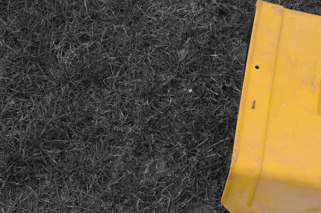
The composition of the photograph is one of the most important things to consider when taking a photograph so experimenting with this breaks one of the first rules of photography. However I like the fact it adds some enigma to the images and makes the audience wondering and imagining what the rest of the image looks like making the bigger picture that's not visible very subjective and personal.
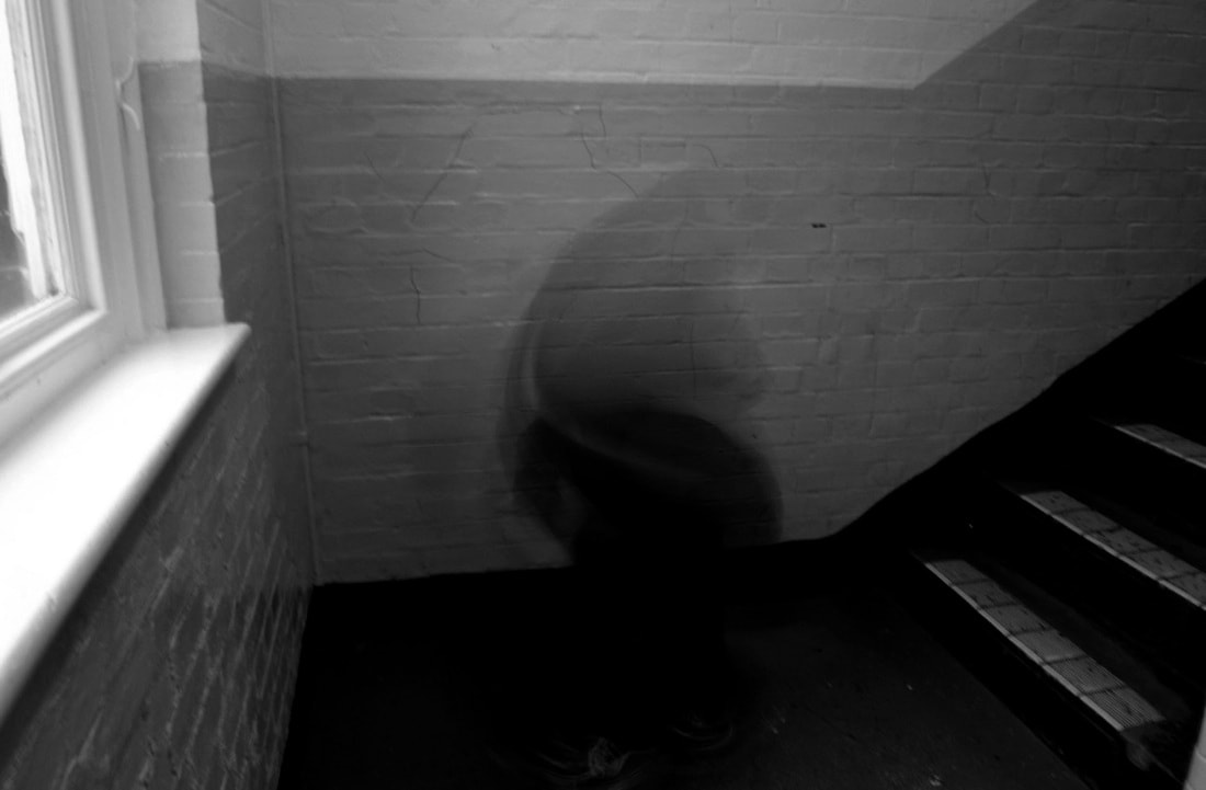
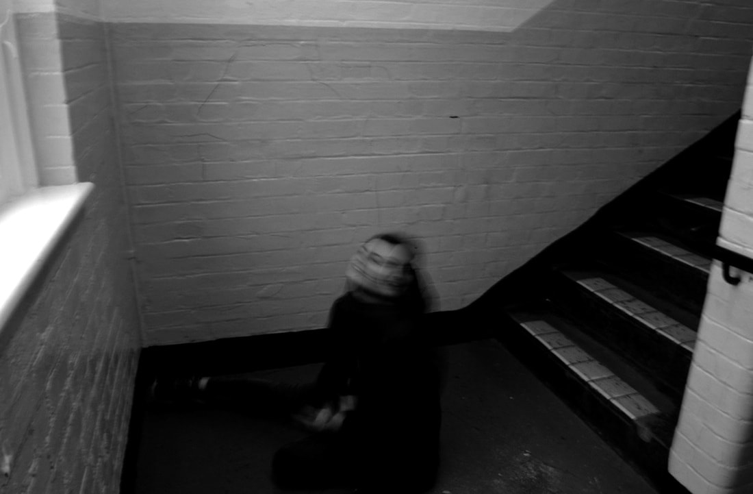
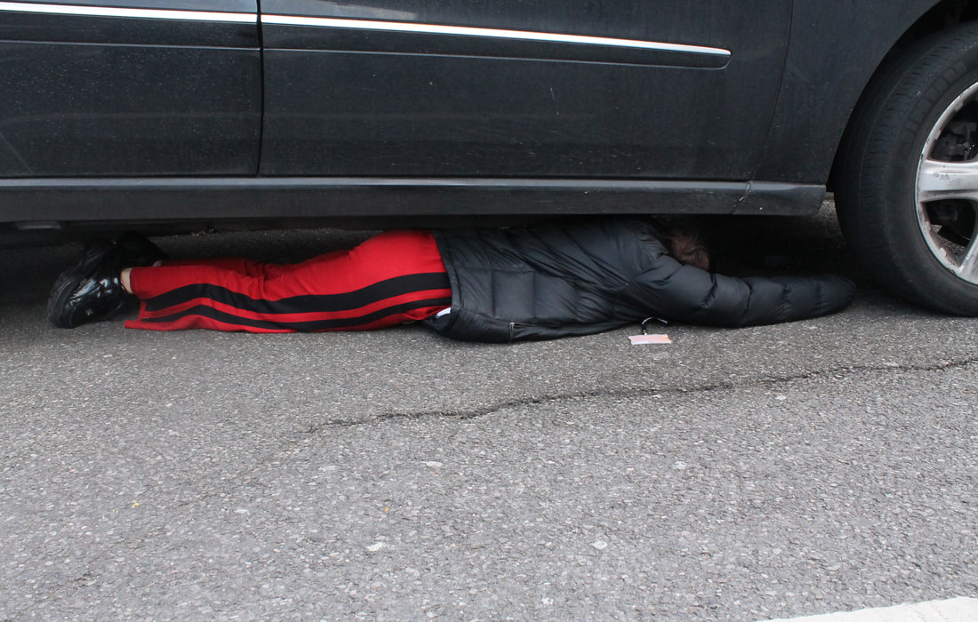
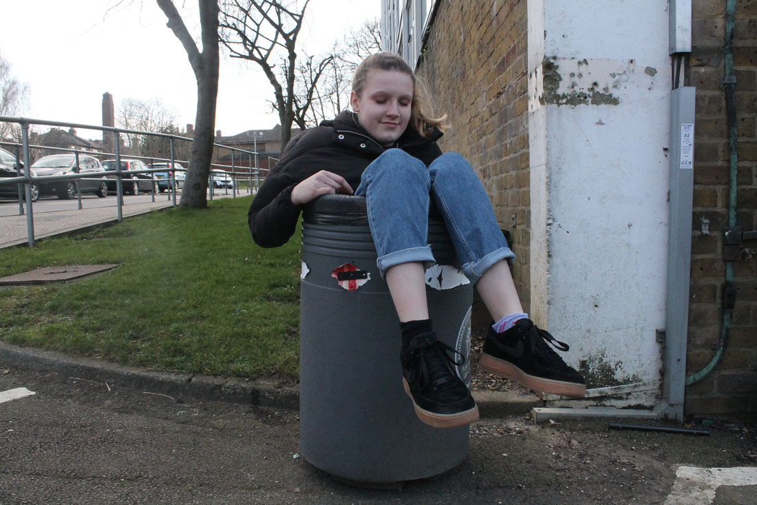
Limited space
In this section I will look at the concept of people squeezing into very small spaces. I will look at the work of Willi Dorner and Irving Penn as both photographers fit their models into small spaces.
Small spaces
Willi Dorner
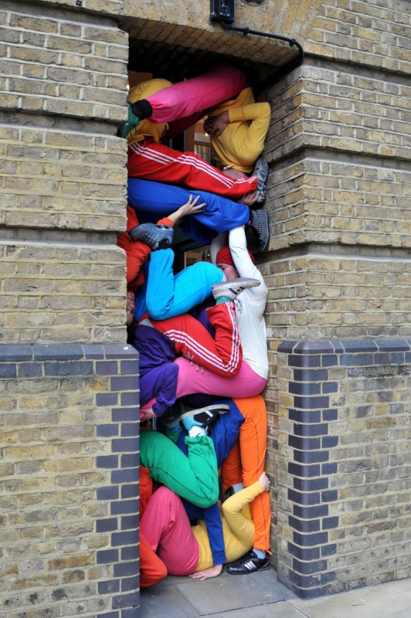
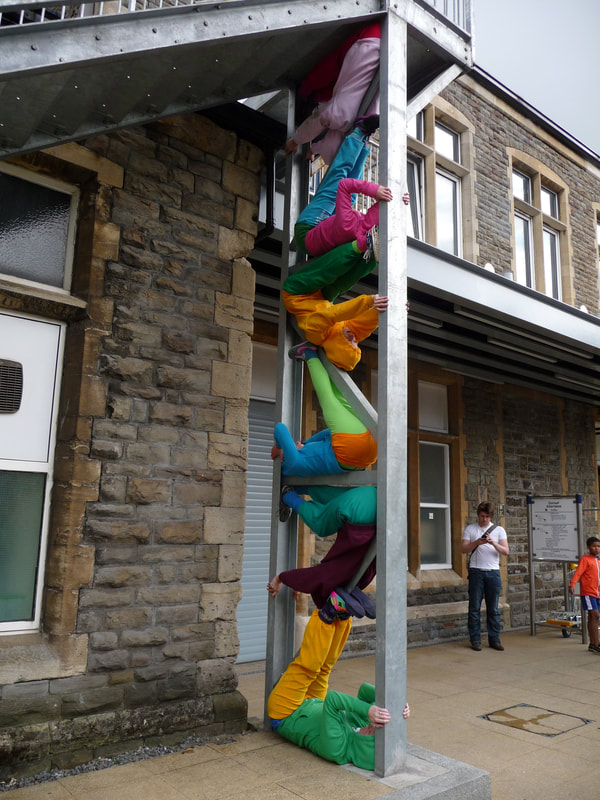
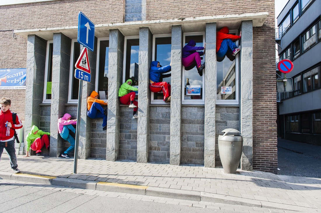
Willi Dorner squeezes human bodies into nooks and crannies for his Bodies in Urban Spaces project. Groups of dancers, climbers and performers wearing brightly coloured clothes run through busy shopping centres and high streets, cramming themselves into doorways, alcoves and any gap they can find in public buildings. The group of 20+ performers have often got attention from local police who had feared that the groups were burglars or vandals, but to Dorner even bad reactions from the public and local authorities are considered a success. "The project is about making people think about codes of conduct for behaviour and where certain behaviours are appropriate or inappropriate," he said "A public bench, for example, you are allowed to sit on it but not lie on it or stand on it. When you see someone behaving differently to the social norms it catches your attention...We are never causing any damage or aiming to upset anyone. Some people love it and laugh or smile but others respond very negatively. They shake their heads and say we shouldn't be climbing around. The mix of reactions is amusing. America and the UK were certainly the most difficult places to do the performances," he said. "Britain in particular has such a strong health and safety culture it made organising the shows quite a challenge"
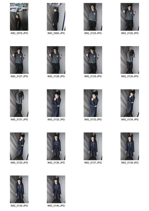
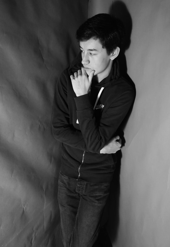
Response
For this task I photographed my classmates in awkward places in awkward positions. The space limits the person's movement so they feel trapped in the space and the image.
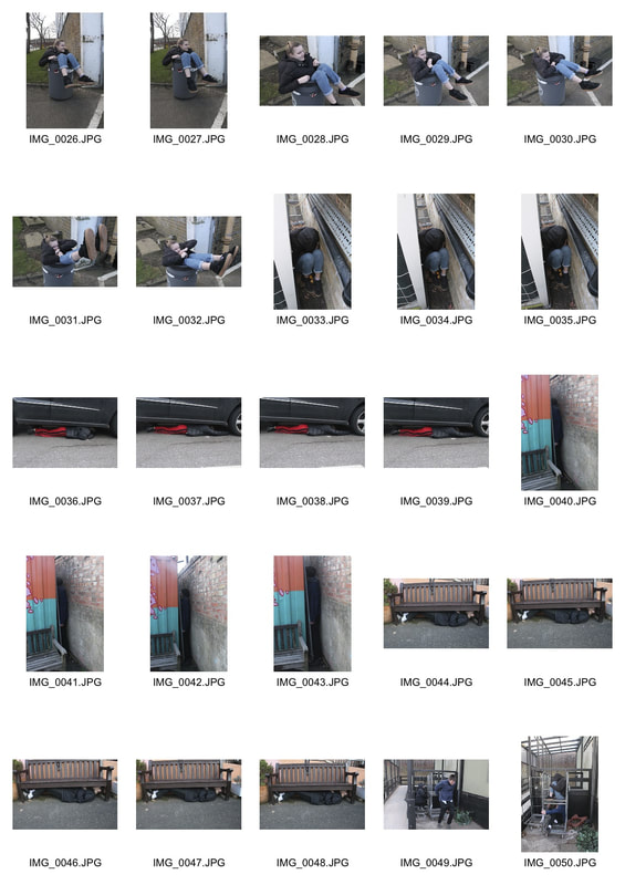
For my response I chose the images where the person is in a very tight space so that the subject feels most trapped so that their facial expressions are genuine.
|
|
To make my images better I would have the subject in different colours like how Willi Dorner had in his images. This will make the subject stand out more which further expresses freedom of the subject and show how they don't belong in the environment.
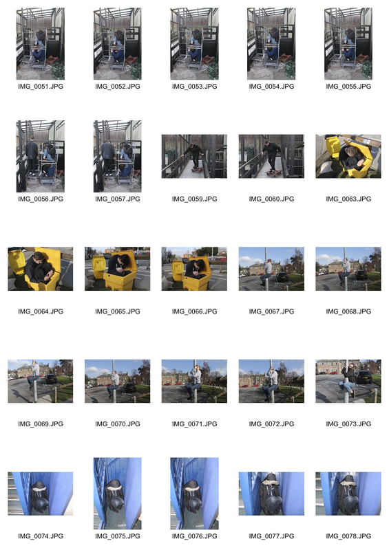
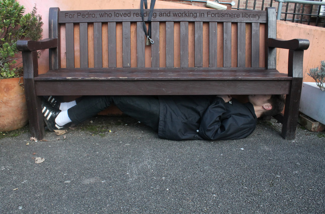
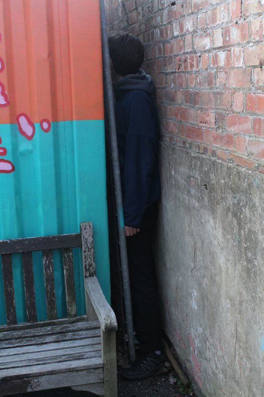
Studio walls
Irving Penn
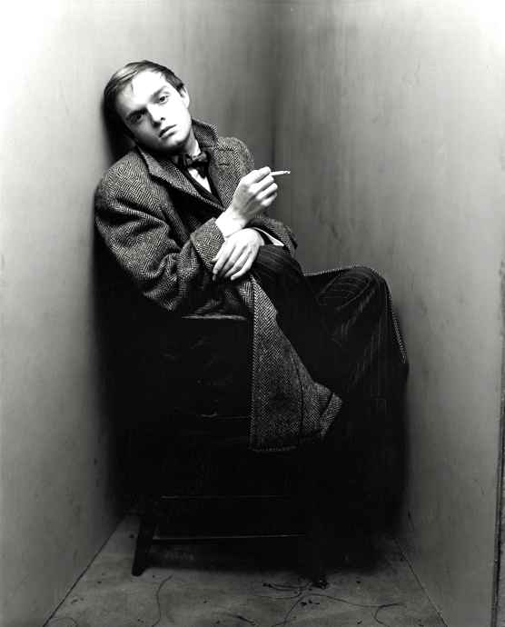
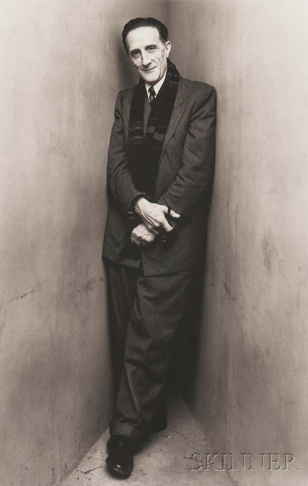
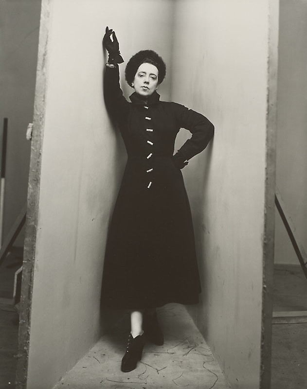
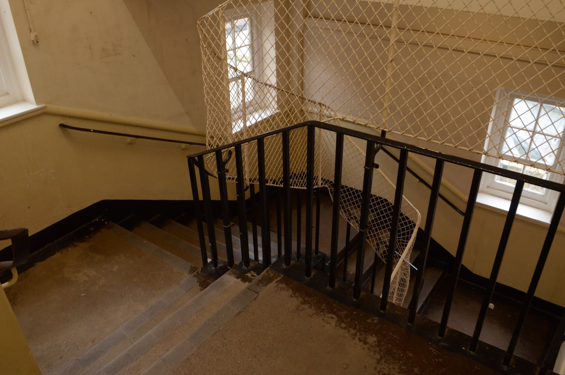
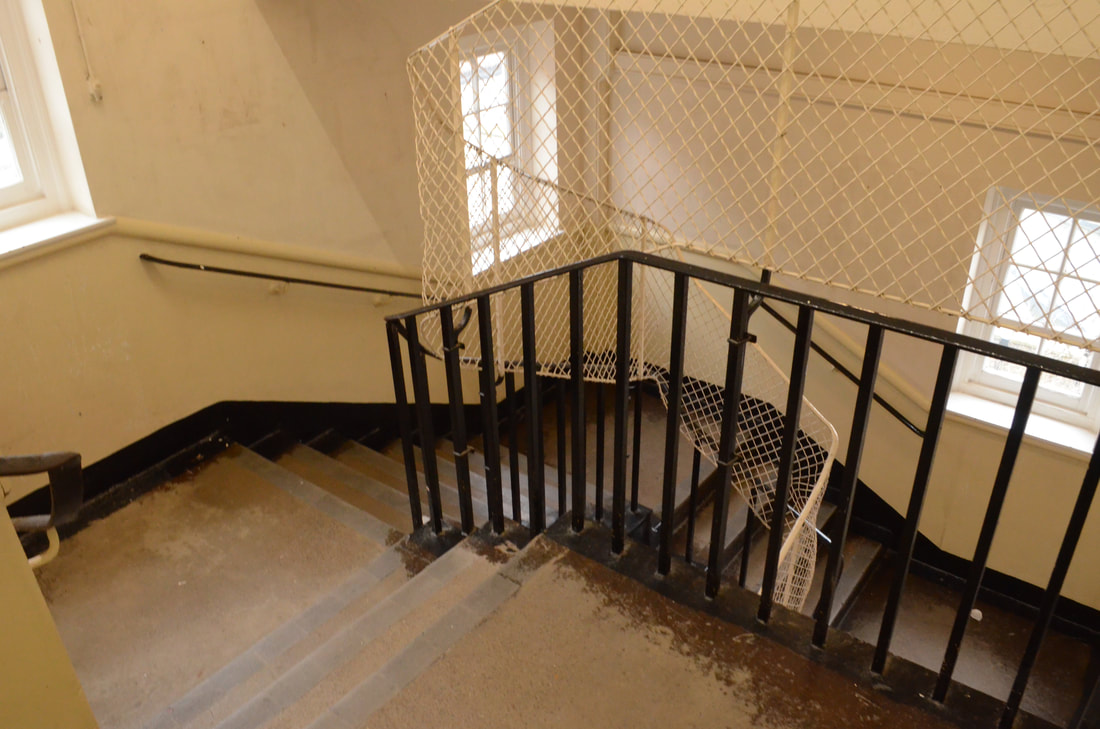
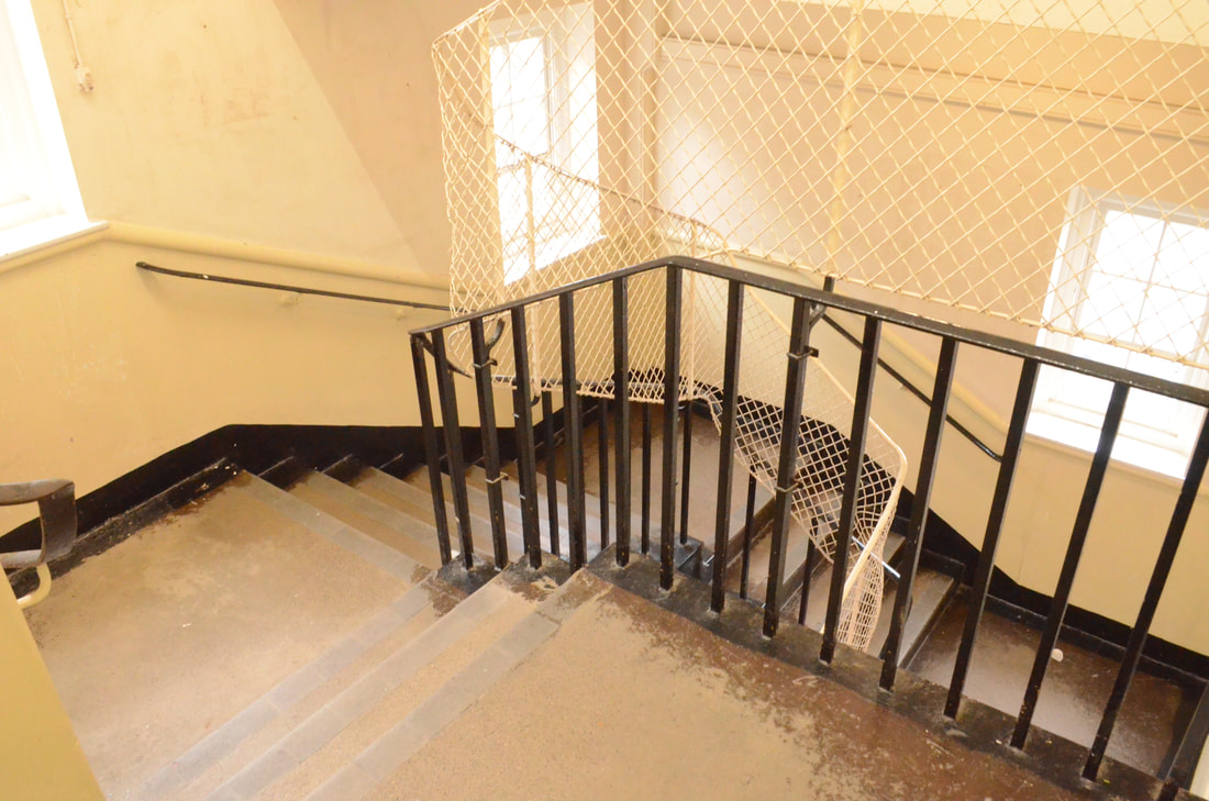
Around 1948, photographer Irving Penn began making unusual portraits of a number of writers, artists, musicians, politicians, dancers and other celebrities. Each one was asked to position in a small corner (sharper than 90°) created with two studio flats pushed together and a carpet on the floor. The photographic studio was no longer part of the natural environmen, but became an active agent of it as it was included in all of the photos. This changed the composition, emotions and tones of the photographs. Irving Penn allowed the studio to have a presence in the images, electrical wires and photographic materials are often seen in the images. The studio becomes a architectural limiter of the subjects movements.
My response
This task limits the space of the subject between two walls, this will create a feeling of claustrophobia and uncomfortable to stand in.
If I was to go back and improve this task I would have different colour walls beside the subject to give them individuality and express the emotions more.
Studio paper
The purpose of this task is to represent limits in an image. The images below show the model limited to the space of a sheet of purple paper.
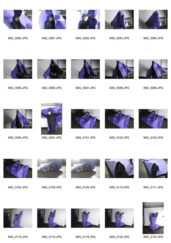
I feel that this task gives a visual representation of limitations by physically restricting the subject and squeezing them into small spaces. If I had more time I would experiment by adding more than one model to create even more of a feeling of limitations.
Threshold
Keld Helmer Peterson
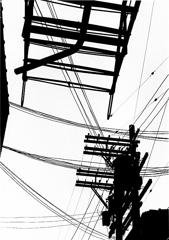
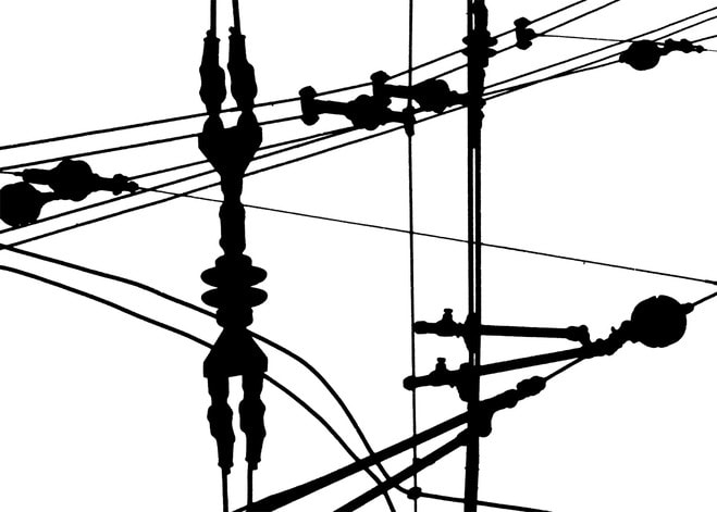
Keld Helmer-Peterson was a Danish photographer who was inspired by Albert Renger-Patzsch, the experiments at The Bauhaus in Germany and by Harry Callahan and Aaron Siskind at the Art Institute of Chicago. He achieved fame for his colour photographs but he also published several books of black and white images that explore dramatic contrasts of tone. In some, we are presented with images that are black and white with all mid tones have been removed. He created and found these images, using both cameras and flat bed scanners to achieve the effects he was looking for. The books encourage us to consider the space around the image and the accompanying text as integral to the meaning of the work.
Response
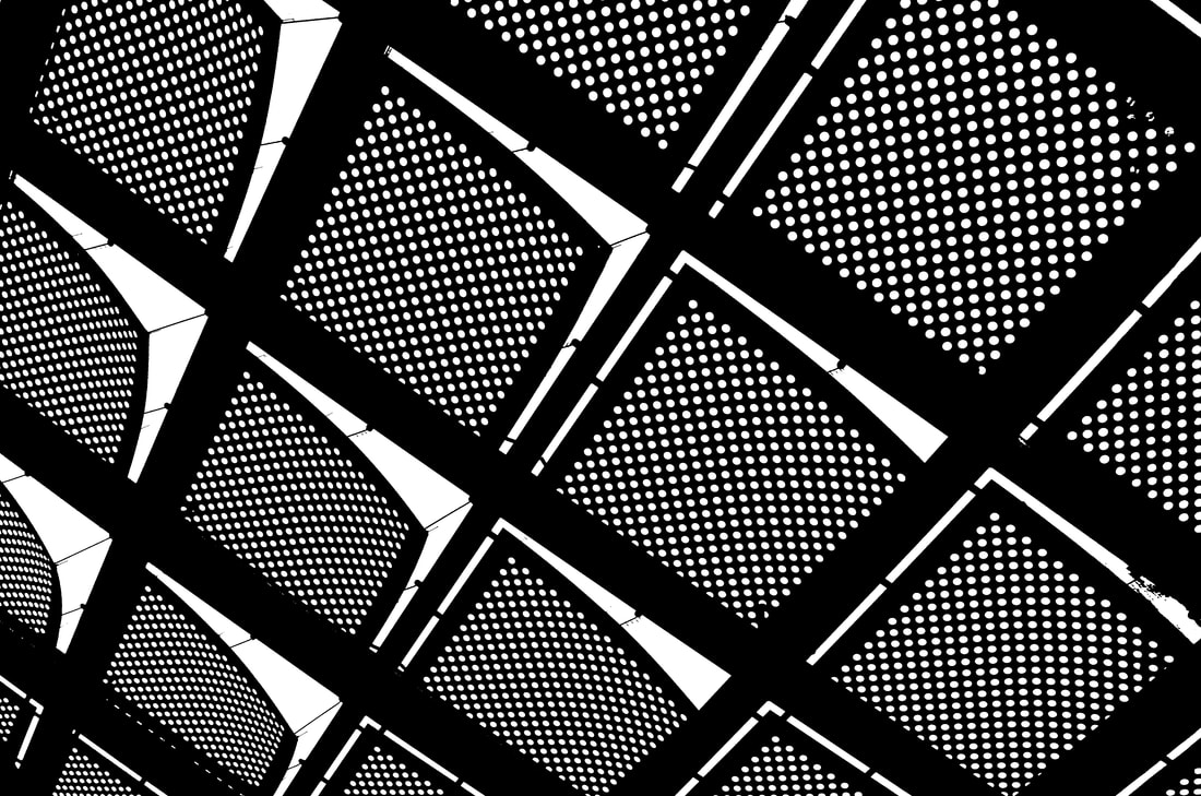
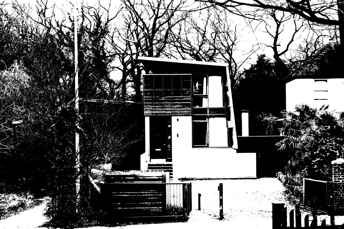
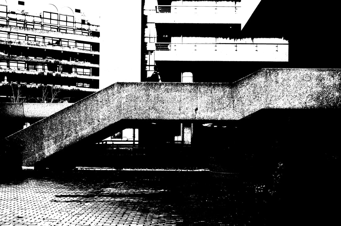
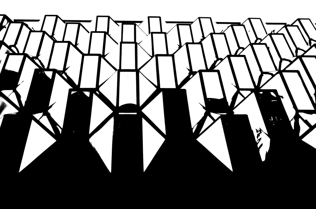
I chose to photograph buildings in this image as it fits my theme for my strands and will link nicely. Furthermore the shapes of buildings vary as they arn't limited to just one structural design. This task emphasises the outline and the structure of the buildings.
Barbican Exhibition Visit
Another kind of life: Photography on the Margins
This exhibition is about people on the edge of society who don't fit in with the 'norm' of the complex social structure. It includes 20 photographers from all over the world from the late 1950s until present day. Each room has a different photographer so you can immerse yourself in the photographers work and the journey they took to create their collection in the exhibition. To draw the audience each room could see into another drawing you to walk from room to room and really engage in the photographer. furthermore some rooms had physical objects, screens, TV, audio and different sized images to make them stand out from the rest. A few of my favourite from the exhibition included: Mary Ellen Mark, Pieter Hugo and ...
Mary Ellen Mark
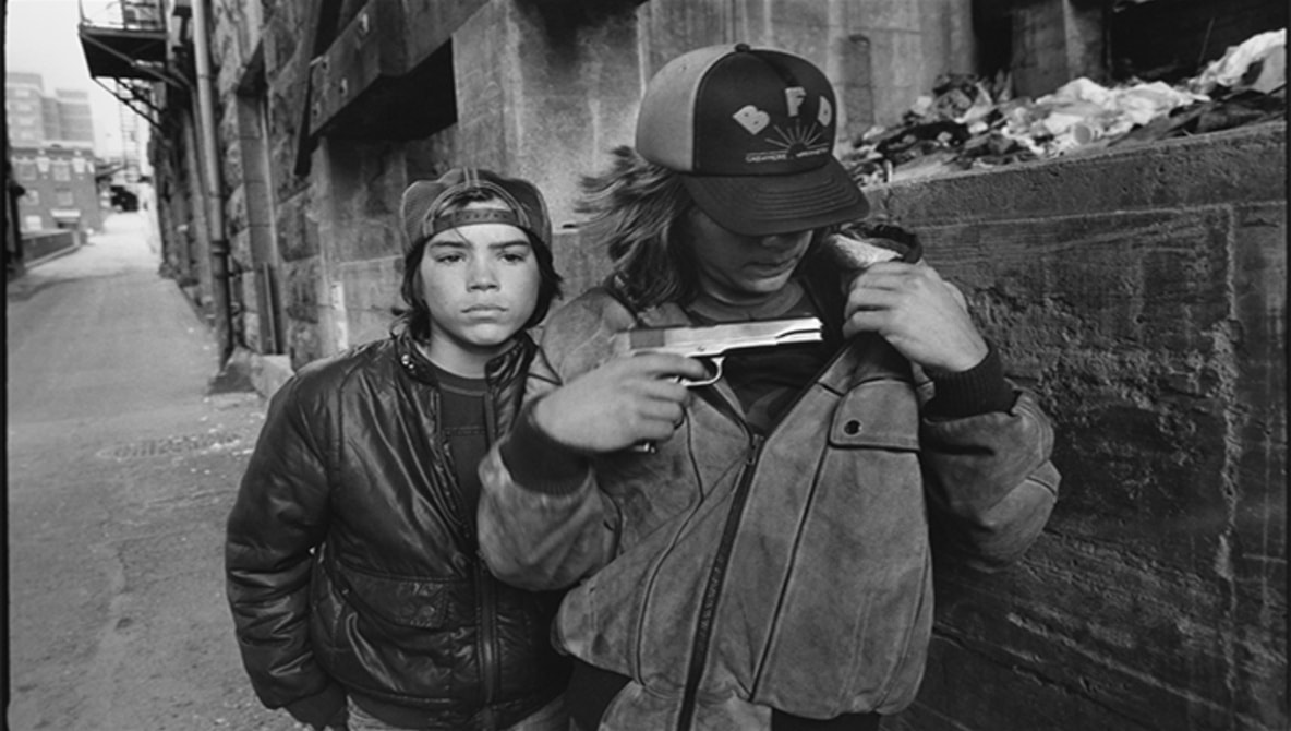
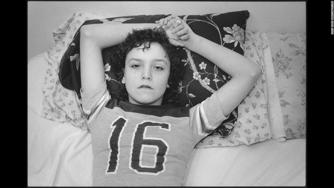
New York photographer Mary Ellen Mark’s long term project, Streetwise (1983) focuses on her time spent with Erin Charles, a street kid known as ‘Tiny’, who she first met as a 13 year old and shows the harsh realities of life on the streets of Seattle. Whilst Indian photographer Dayanita Singh formed a deeply profound and meaningful friendship over 30 years with Mona Ahmed, a eunuch from New Delhi who was both feared and revered, an outcast amongst outcasts, living much of her life in a cemetery. As well as the groundbreaking photo book, with profoundly honest and frank words by Mona, the exhibition includes a poignant film, shot in one take, of a very still Mona listening to her favourite song Rasik Balma from the 1956 romantic comedy Chori Chori.
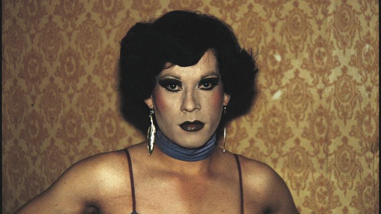
Pieter Hugo
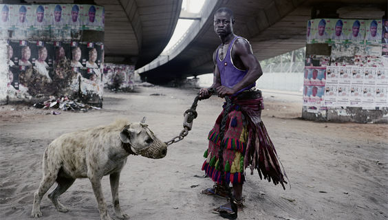
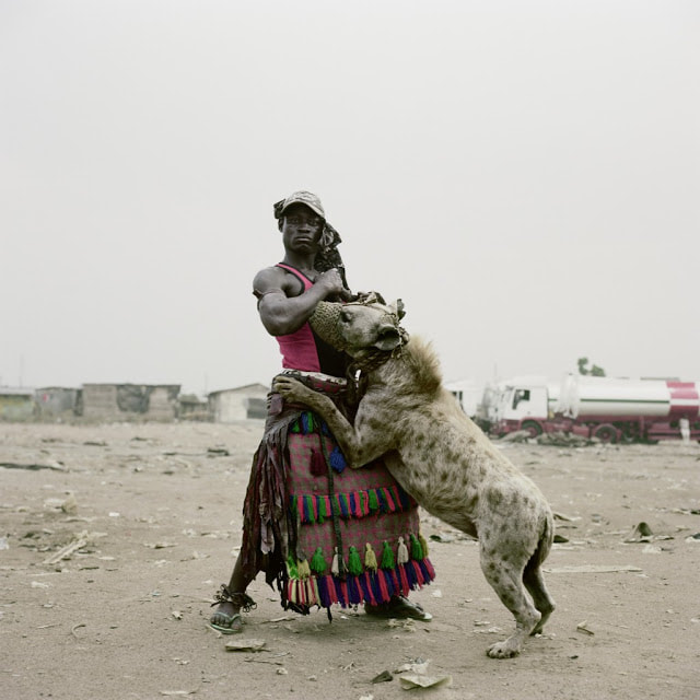
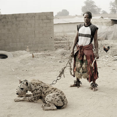
The Hyena and Other Men (2005–2007) by South African photographer Pieter Hugo of a group of urban nomads from Nigeria; legendary American photographer Bruce Davidson’s series The Dwarf and Brooklyn Gang taken in the late 1950s in New Jersey and Coney Island; and recently discovered at a Manhattan flea market, a collection of around 400 prints taken during the mid-50s and 60s at Casa Susanna, a private retreat for transvestites— a safe haven in upstate New York where they posed for the camera, in glamorous dresses, playing cards, eating dinner and having drinks by the fire.
Three Strands
|
|
|
|
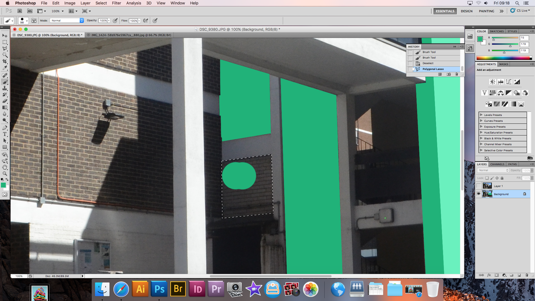
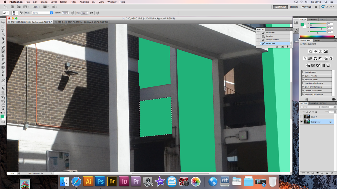
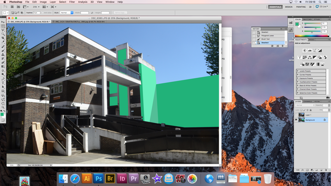
Strand 1
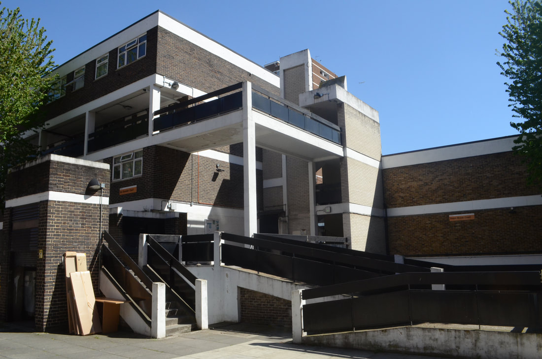
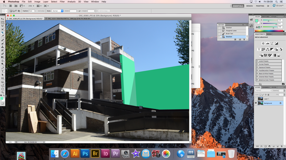
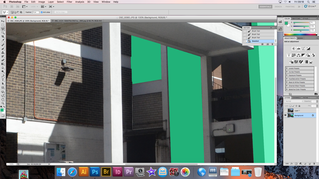
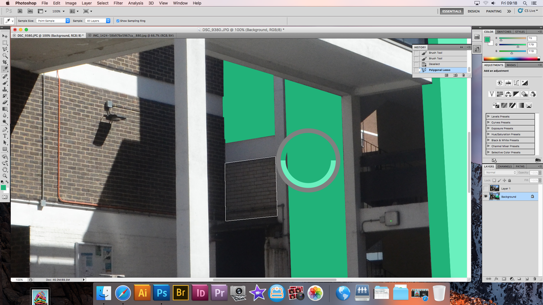
Paul Eis
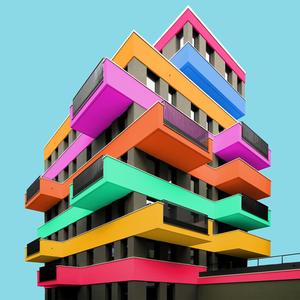
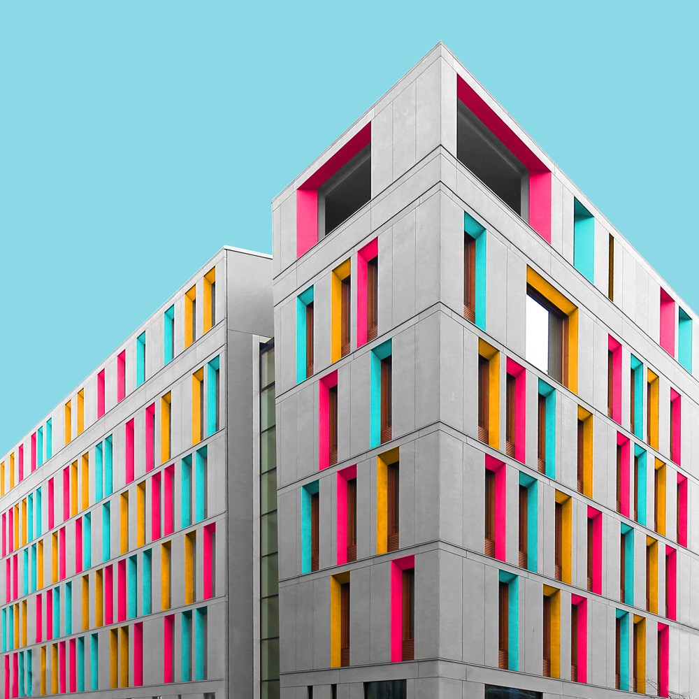
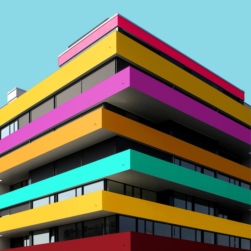
When colouring buildings, Paul Eis orientates mainly towards characteristic elements like balconies or windows. The colour palette is intended to be either purely complementary, rich in contrast, or to define a colour gradient. But always use at least one colour that suits the background. Also, the order of the colours in each image depends on the building's structure. When the building has a clean geometry, he orders the colours in a somehow repeating way. But when it has a random structure, he usually chooses a more random order of colours.
Response
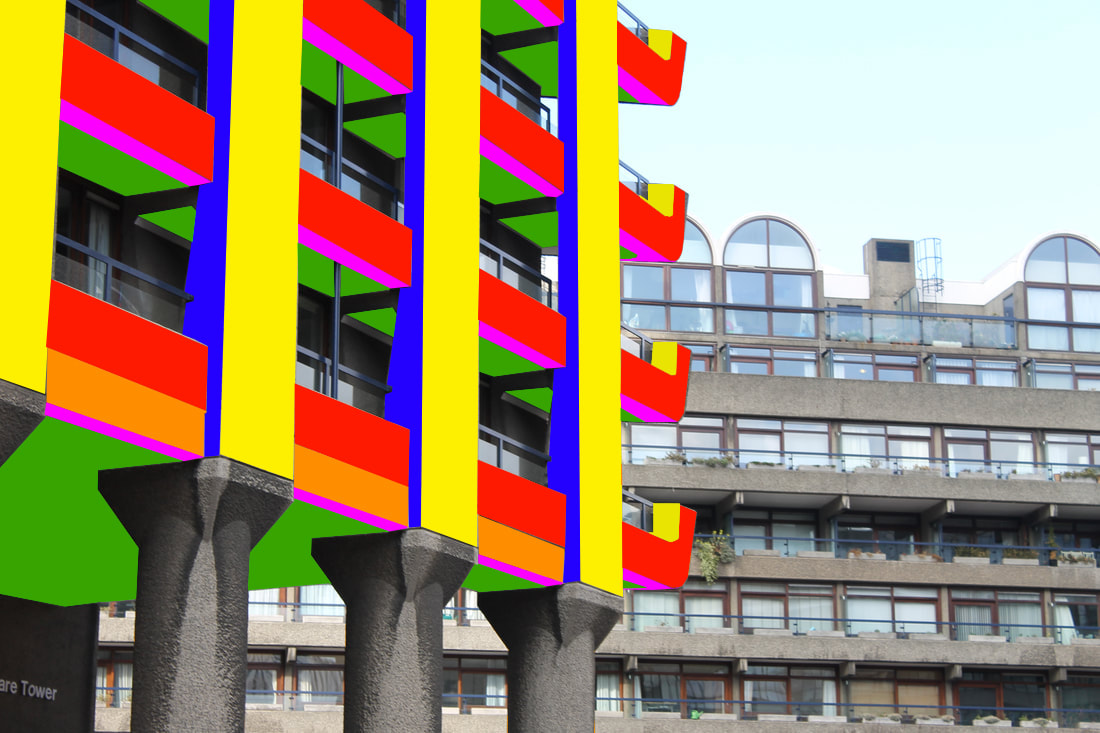
This image didn't turn out how I wanted it to as there were obstacles in the way of parts of the building i wanted to change the colour such as plants in the way, glass barriers and support poles. To improve on this I need to make sure the building i photograph has to have no obstacles in front of it. Furthermore the colours don't mix very well due to the brightness and that they have the same tone. For my next response I will use a colour wheel to find the correct colours.
Strand 2
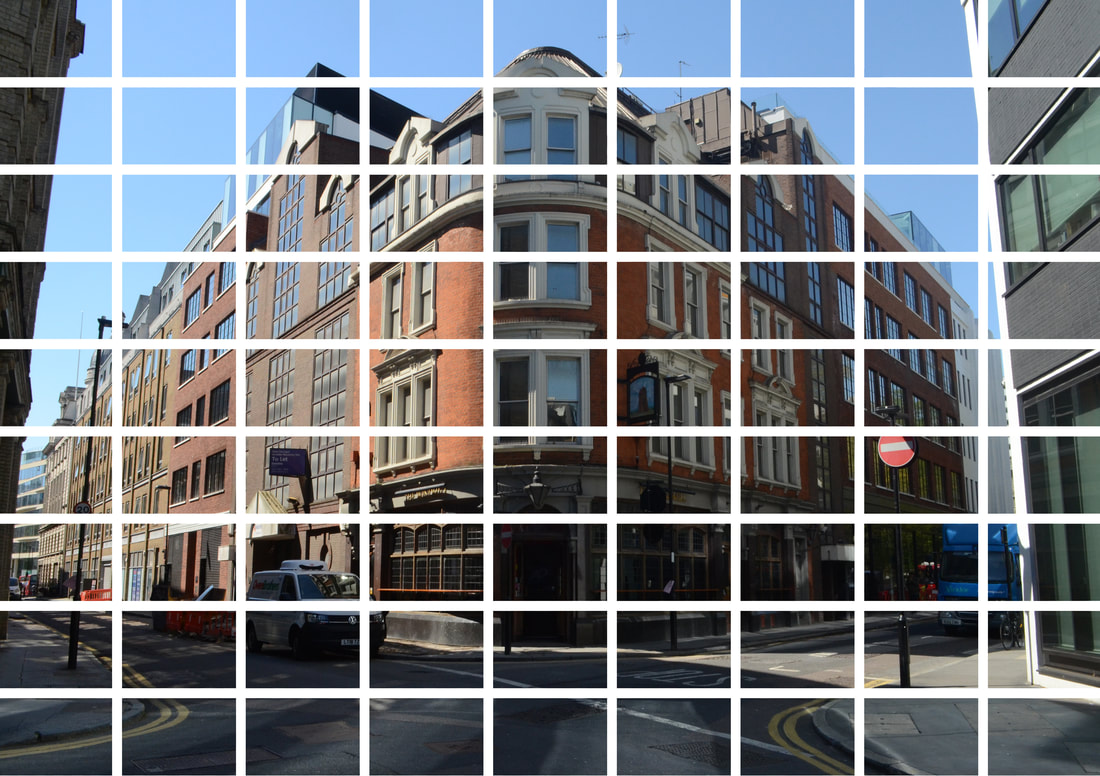
Thomas Kellner
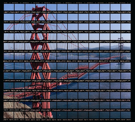
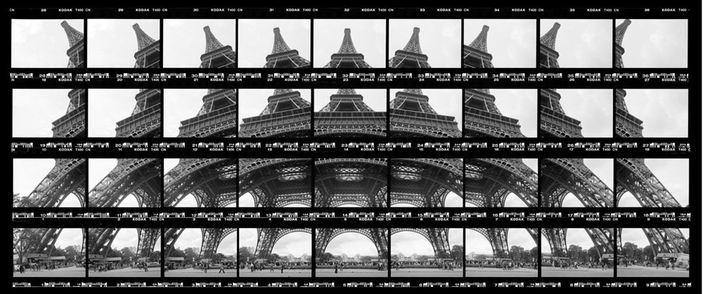
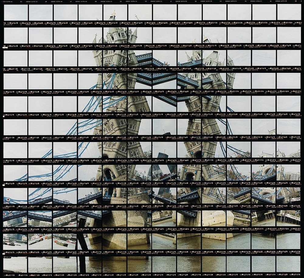
German photo artist Thomas Kellner is known for his photographs of seemingly dancing architectural exteriors and interiors of tourist attractions from all over the world. Even though his photographs show popular motives that have been mass-produced, his work is unique due to his new artistic method called “visual analytical synthesis” in which he does not take one shot but several thoughtfully planned ones in order to create a picture out of contact sheets. His work is often referred to Cubism considering that his creative process includes a construction but the results resemble a deconstruction.
Development 1
For this development, like Thomas Kellner, each square is an individual picture I manually took at the time as opposed to splitting up the image in photoshop.
Development 2
For this development I used one image and broke it up into even sections on photoshop. This allowed me to have many more sections and create a neat pattern.
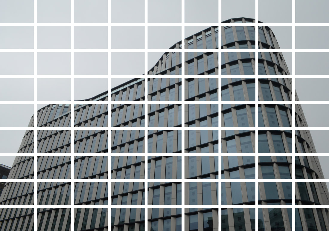
I'm happy with my development as I was able to create a neat template to line up with the image above. This makes the images feel like a set that your supposed to have together as they both compliment each other by having the same pattern.
Strand 1 - Development 1
I developed the first strand as I felt there was a lot of potential to develop the strand. In my first edit I didn't fully understand what colours mixed and why it didn't quite look right. However I have been researching colours and used colour wheels to create the next develops so I can improve on the first development.
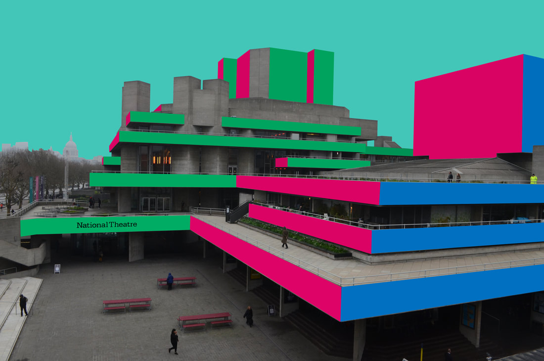
In the image I decided to leave the people in the images so the buildings look like that's the norm in this world as people aren't fascinated by the design and colours. In both images I decided to make the sky a solid colour as I wanted to keep up the colourful aesthetic. Furthermore it compliments the pink colour well also.
Development 2
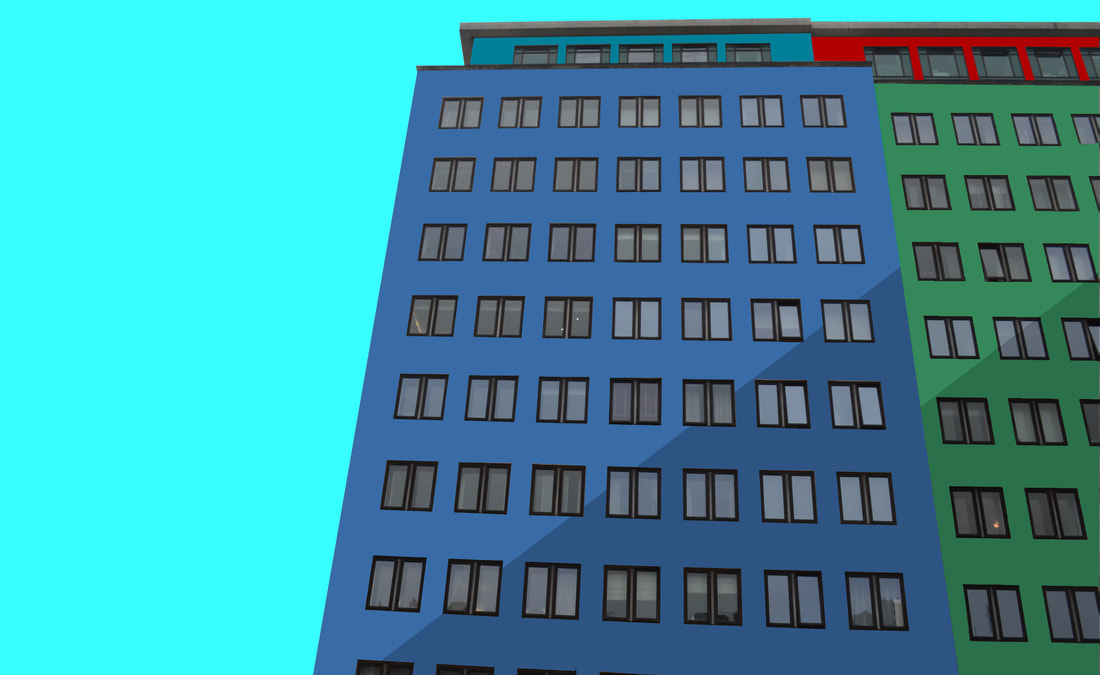
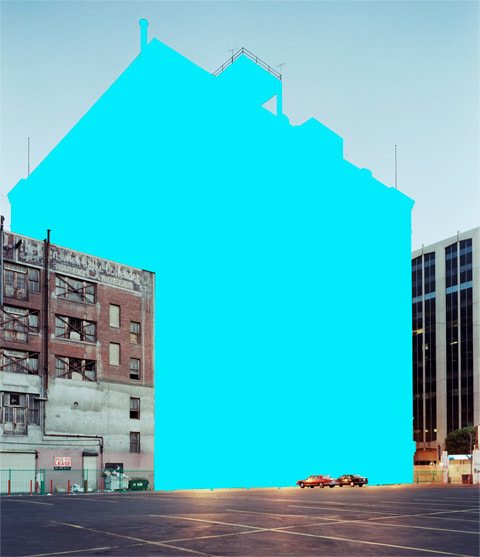
Mauren Brodbeck
Mauren Brodbeck looks at simplifying buildings by colouring the whole building in one colour. This abstract aesthetic makes the buildings stand out from the others around them. This development looks more at making the buildings look abstract as opposed to just colouring parts of the building, like in my previous development, the building looks like one solid object.
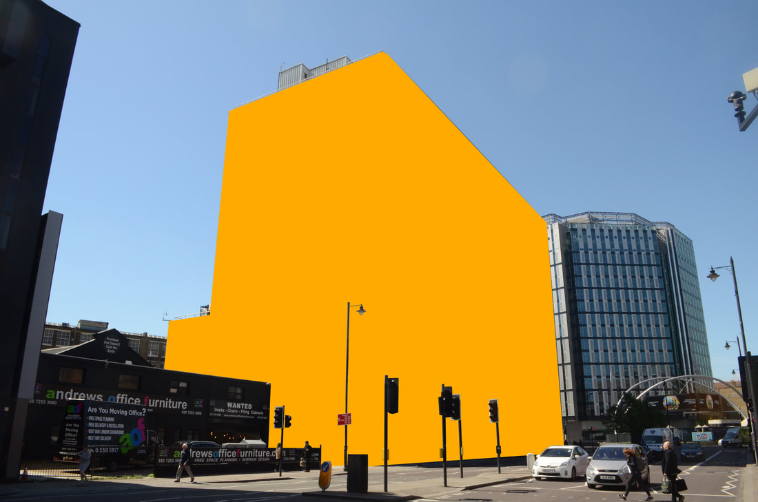
Response
For this photo I chose to use orange as the colour for the building. This is because orange is a direct contrast with the blue sky as they are on opposite sides of the spectrum so therefore the colours compliment each other. I chose to use a detached building to emphasise the fact it sticks out and is unique.
Final pieces
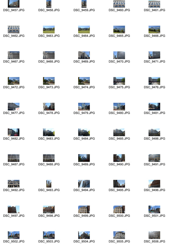
For my final pieces I walked from Old street to Hoxton then down towards Aldgate east then ended in liverpool street.
Contact sheet
|
|
Development 3
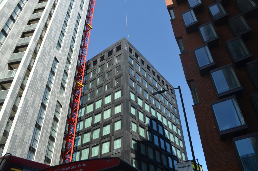
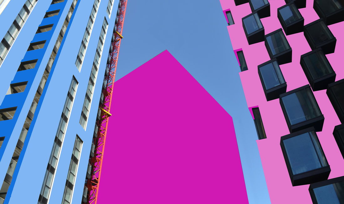
For this Development I linked the work of Paul Eis and Mauren Brodbeck into one photograph. The buildings on the left and right of the image are inspired by Paul Eis and the one in the middle is inspired by Mauren Brodbeck. The two similar styles mesh together really well as you can still tell what the image is even though most of it has been edited leaving just a small part of the original.
|
|

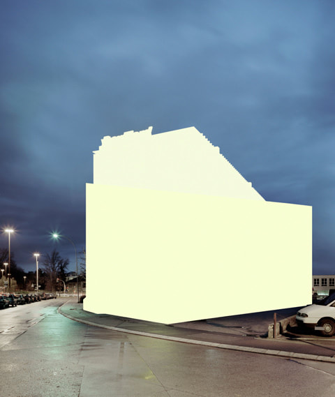
Development 4
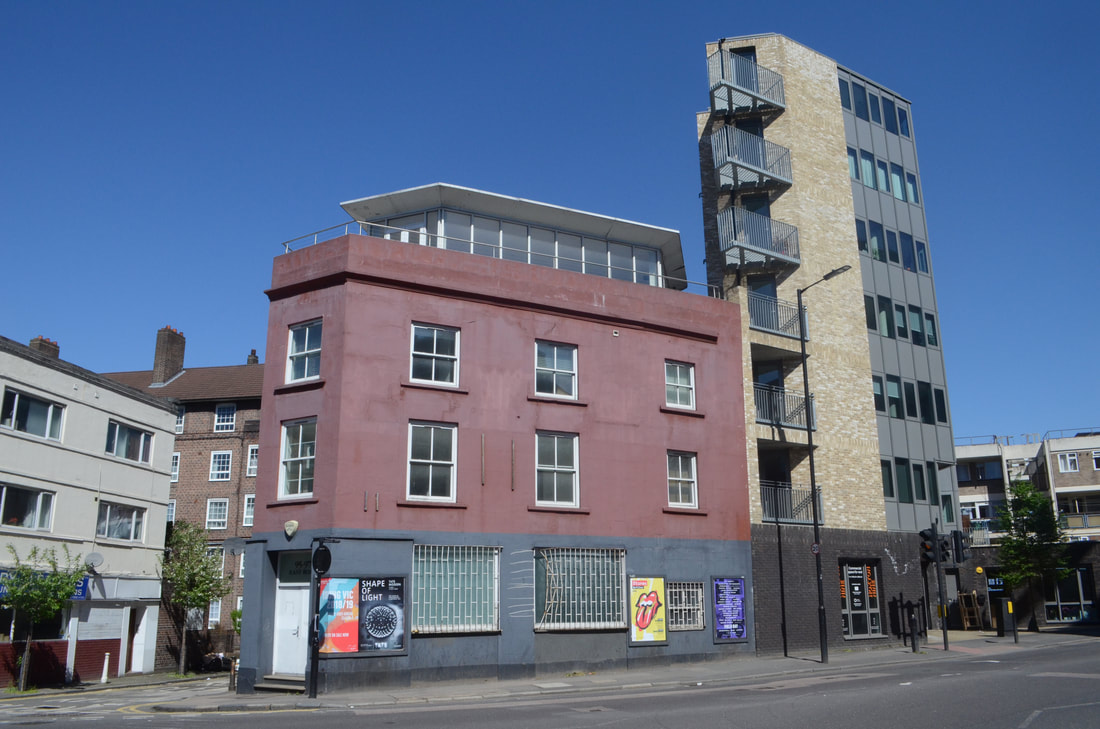
For this development I chose to leave the surrounding of the building untouched. When I started editing I was planning to colour the whole image however when I came to this point I liked the aesthetic of the image and thought that 'less is more' so decided to stop.
|

|
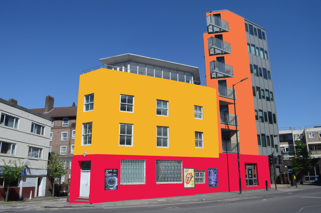
I thought this image could be improved by colouring in the whole building. I realised after printing the image that I left a bit uncoloured where it should have been painted orange. Next time I will take more care and really carfully pay attention and double check for any mistakes.
Development 5
For this development I spent hours editing the finest detail of the image. I made sure that I darkened all areas that had shadows in the original to make the building look more complex. Furthermore I had to photoshop out the tree on the left and create windows on photoshop from scratch where the tree was covering them in the original.

Process
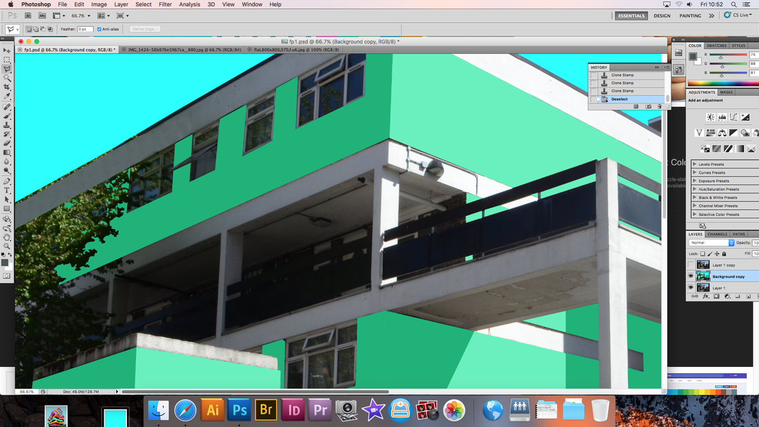
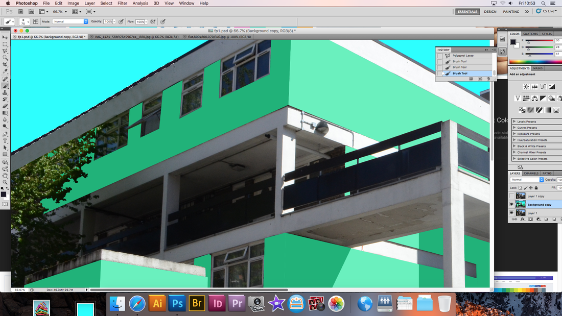
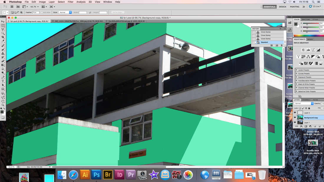
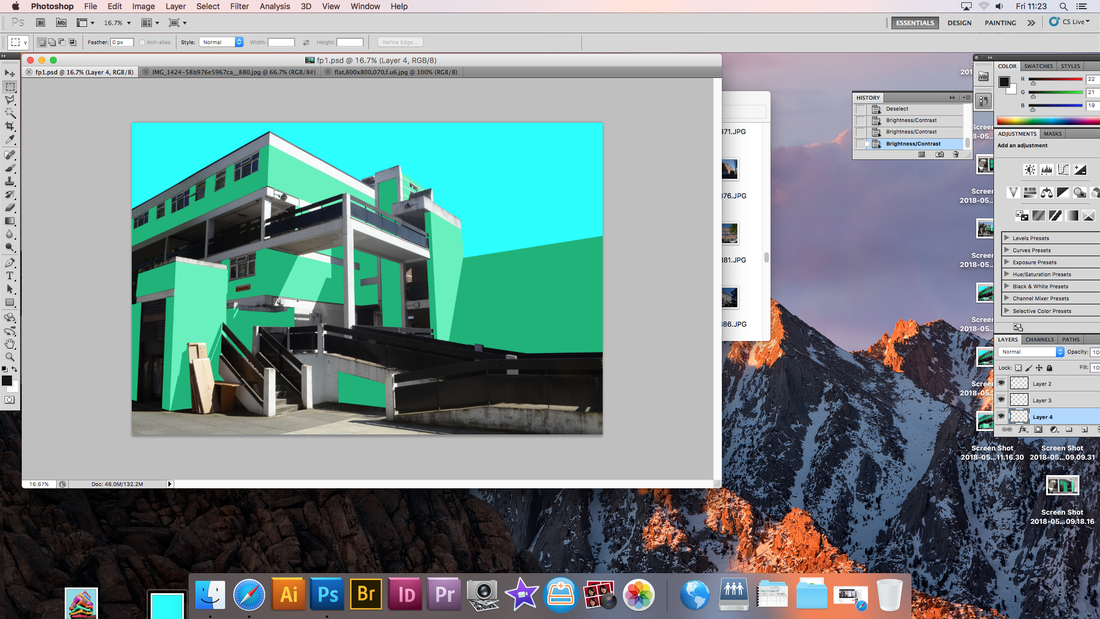
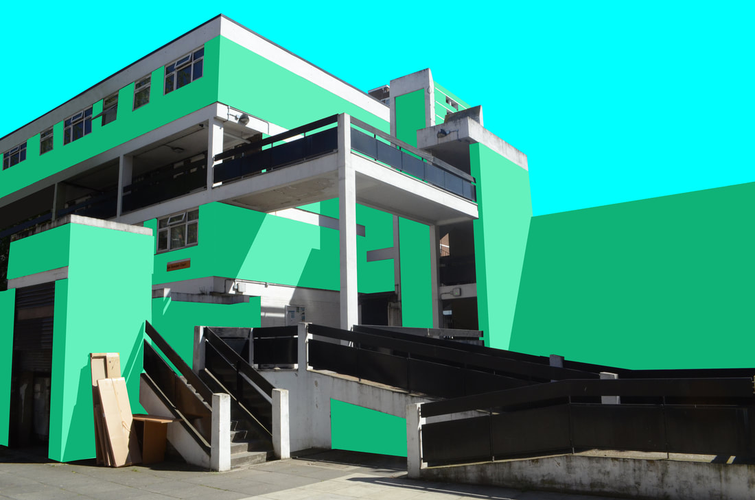
For this image I chose to choose 3 colours to edit the image with. The light green for the areas with the sun on them , the dark green for the shadow areas and the blue for the sky and surroundings. The tones of the colours mix very well unlike my first response, so there is a clear contrast between light and dark areas.
